Wednesday, November 18, 2015

Puzzle Research

Life is Strange Puzzle Analysis
In Life is Strange, the mechanics are moving, examining, interactions like pushing and pulling, and time control. You can reverse time and undo things, but still have object permanence (once you pick something up, it stays in your inventory even if you reverse time).
In episode 4, you find yourself in an old barn and you must open a secret vault door hidden on the floor. It's too heavy and locked to lift, so you have to find another way. You climb up to the loft, and pull down an old motor to climb higher. Once you're up there, you reverse time so that the old motor is on the same level as you. The motor is attached to a rope, which is attached to a hook. You ask your friend to attach the hook to the door, and then you push the motor down, which forces the door open.
The game provides all the pieces of the puzzle pretty well by showing that they're an option using the HUD.

Everything that needs to be done is spelled out, but figuring out the order and where to go and the exploration is what excites the players and makes them feel smart. Using your time reversal to undo pulling the old engine down, and using the force of the engine to open the door are two not totally obvious solutions to the problem that make the players feel clever once they realize the solution.
So, the puzzle includes unusual use of an item (using the weight of the engine) and a sequence puzzle. For example, if you don't attach the rope to the engine and to the door, then pushing the engine off will mean nothing. 

Monday, September 21, 2015

Toy/Prop Game Design Ideas

Here are the ideas that I decided to pursue further: the super kicking boots, the cloud gun, and the shield that can catch projectiles and send them back.
From here, we're going to pick one of them to go further with.


Thursday, September 17, 2015

10 Hero Prop Game Mechanic Ideas

Love Glove - Shoot Love hearts at your enemies! Make them happy and stop attacking you! You have to hug to recharge your love glove.

Laser Helmet - Fire lasers from your face! Face shield closes when firing.

Crunch Boots - destroys pieces of earth below you when you doubletap spacebar.

Drill Arms - charge at enemies! Drill them to bits! Drill through walls to reveal pathways! Connect your arm gauntlets to use.

Cannon/Launcher Backpack - see DFA character. Launch cannonballs.

Plasma Flamethrower - Throw blue fire.

Steam Machine Gun - Fill the area with steam clouds that you can jump on!

Guitar Gun - Shred on it, channel lightning, light candles/torches, turn on generators, etc.

Ricochet Shield - Return enemy attacks when timed correctly by catching energy in the shield capusle.

Pulsar Launcher - Lob pulsar grenades. Has cool capsule reload thing. Clears an area (of lava, toys, foliage) so you can walk on it.

Monday, April 20, 2015

Burger Time Re-Make

I'm going to be working with my partner, Leslie Glanville, for the next project in Programming. Together we're going to remake Burger Time in UE4 by using the Sidescroller project template.

It poses an interesting programming challenge that will involve researching how the engine interacts with players and pawns and inputs. We will need to program ladders, falling burger ingredients, basic locomotion, a basic or workaround A.I. system for the enemies, a life system and a pepper attack system. We also have a fun challenge of recreating the classic Burger Time feel, either maintaining the retro style or going for an updated look. Our asset list includes the Chef, the enemies: a sausage and an egg, ladders, burger ingredients, platforms, and salt pick-ups. If we have extra time, we may be able to incorporate some fun particle effects, such as for when the ingredient lands on the platform below.

I bet I'll have a lot of fun.


Thursday, April 9, 2015

Racing HUD

We're going to design a specific HUD for our vehicle. My car is a 1970 Ford Mustang Mach 1, so they have a particular style. I'm probably going to try and replicate that.
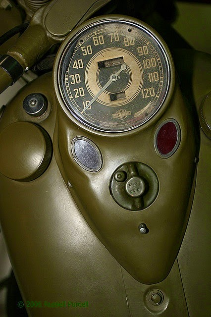
Here are some photos of the style of that age.
I like the interesting colors on this one pictured above. Having the second tone to delineate mega-fast speeds is an interesting idea. 

Including details like mileage, fuel or RPM might be fun, even if I'm just going to have to fake it somehow. On the other hand, it may just confuse the player.


This is a nice and simple design. The shape of the pointy-dial thing is an important detail. The font is also very specific.

Game Trailer

We're going to be making a promo video for the level we've been working on this semester. Right now, we're doing some research on what some industry gameplay videos look like. Here's one from Need for Speed Rivals 3.


I liked it for its simplicity. It works well to show how pretty everything is and the variety of gameplay actions. The motion design in it is also really nice looking and doesn't get in the way of the actual gameplay.

Tuesday, April 7, 2015

Friday, April 3, 2015

Particle Research

I want to make some kind of magical looking smoke.
Here's some reference for what I might try to do.


Monday, March 16, 2015

Turret and Barrel in Action


Here's a video of the dog-statue-turret in action, complete with explosive barrels. The turret follows you around, fires every couple seconds with an animation, the cannon rotates up and down, the barrels will catch fire if they are thrown relatively softly and then explode, and if thrown hard enough, will explode on impact.

Monday, March 2, 2015

Barrel and Turret Concept

In Programming, we're learning how to make "barrel"-type items, where they explode after being hit. We also have to make a turret that launches the barrels. To match my theme, I'm going to do a pot with some dangerous magic or alchemy or something inside. If you hit it a little bit, it'll start emitting green or purple smoke, and then make a big explosion. 
For my turret, I'm going to take one of the statues I was planning to build, and just strap a cannon to it. 


Here are some of the reference I've been looking at.


Race Opening Sequences


We are going to start the art part of our racetrack, and part of that is making the opening sequence! For inspiration, we are looking at some good opening sequences. I think all of the ones from Mario Kart 8 are good, and it helps that that game is really pretty and polished in the first place, but I want to talk about the one for Mute City.
It starts off with a panning out view of this giant sci-fi building with a vast city landscape and gives a really good feeling of what kind of environment this is. Then, they show this insane sideways twisting part of the track that personally gets me pumped up about the race because it just looks exciting. Then, you pull backwards from the starting line, and then you get to start the game! I kind of wish there was one more interesting shot highlighting the track, but what there is does a good job of showcasing what the track has to offer.

Thursday, February 26, 2015

Destructables

In Programming, we've been learning about destructibles in UE4 and using APEX. This is an example of how one could use a destructible to create an alternate path for players to spice things up! The textures/materials aren't mine, they were the ones already in Unreal.

Tuesday, February 17, 2015

Racing Level Greybox

 We are finally done with doing pre-pro planning stuff for our racing level, and on to doing greybox planning in UE4. We're gonna be spending the next couple weeks working out our programming for our stunts and tricks and working out all the kinks, and then go onto making everything look beautiful.
 Here's a shot of the part where the columns will degrade over time and become obstacles.

Here is a part of the level that will offer an option, and will probably have some kind of destructible wall or prop to bust through!

Looking forward to developing our levels with my team!

Monday, February 9, 2015

Racing Game Storyboard

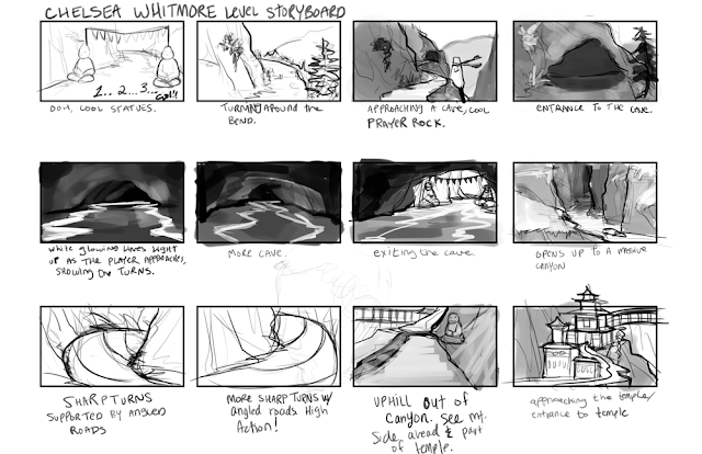
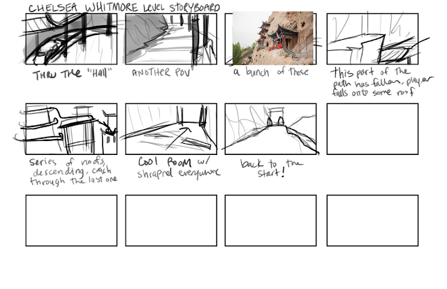
The level I ended up choosing to do is somewhat similar to my original idea. It's set in the mountains, with Tibetan-inspired temples built into the cliffside. There's a lot of rocks and nature and stuff, so I'm excited about it. A lap is supposed to be 45 seconds long to complete, so I wonder if I built it too long.

Friday, February 6, 2015

More Array Action

Just in time for Valentine's Day. We had the class period to mess around with our blinking lights, and I figured out how to make a grid of lights flash different messages using Blueprint in UE4. It was a lot of fun!!
 Hope everyone has a fun Valentine's Day. :)
And here is my code below!

Racing Game Level Brainstorm

We've been making a car in our 3D class, and we're going to be building a racing track level to ride around in. Right now I'm just brainstorming on what kind of theme I'm shooting for.
I really like canyon-esque Death Valley type landscapes, so I might go for that. For example, the environment of Fallout: New Vegas, or the racing track in Fear and Loathing, or Borderlands. Something about the big empty expanse of the desert and the narrowness of canyons appeals to me. I wonder if I can do a cool spin off of that. Maybe, Death Valley + Aliens, or Death Valley Casino/Downtown City, or Death Valley + ...
Going off of the Death Valley Downtown, idea, a concept statement could be: "Only the strong survive the desert," or "The weak lose to temptation," which would be in reference to gambling, or maybe that time Jesus spent 40 days in the desert. Not sure yet.
As a story for the level, I'm thinking about what sort of big thing could happen in a canyon, or in a city area. An obvious environmental event that could happen is an earthquake, causing things to crash down, and players will have to navigate around these new hazards. Then, as more things fall, the level will be harder and harder with each lap. 
Something else, possibly more compelling, that would go with my theme, is that there are other passageways that players would be "tempted" by, at their own peril. For example, speed boosts, or coins that determine the winner, or something.
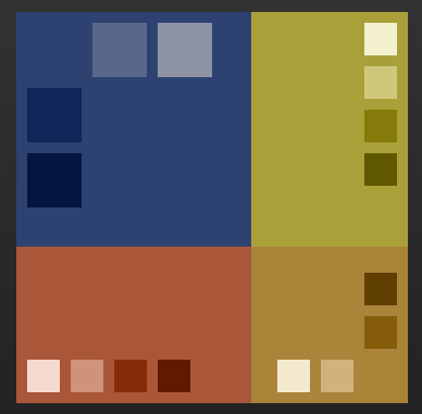
And here are some possible color palettes for this idea.


And here is a papermap of what it might end up looking like, and an idea of some stunts I would incorporate.


For inspiration, I watched a lot of extreme motorcycle racing videos! Here is a Youtube link to one that I enjoyed. I especially liked the bumpy roads, sharp falls, and narrow roads. Hopefully I can incorporate that into my level, although I had a hard time showing small-scale stuff like that in my isometric map.
Excited for this project!


Tuesday, February 3, 2015

Blueprint Array Fun

In Programming class, we've been working with blueprints in UE4 and steadily getting more complex. Recently we've gotten into working with arrays, and above you can see the blueprint for some flashing lights that we've rigged up.
Here you can see it in action!

Sunday, January 18, 2015

Platformer Papermap


Here is the papermap for a platformer I'm designing. The theme is "Science Lab."
I answered some questions for worldbuilding:
Where is it?
A Chemistry Lab on a sunny afternoon in August.
What is the conflict?
Dr. Drake, a reckless chemist, drank one of his concoctions and it shrunk him! He has to navigate his lab to find the antidote!
What is the twist?
Maybe.. it is actually a shrinking potion!
Who else lives there?
Lab rats, roaches, possibly other scientists.
What does the architecture look like?
It looks like a highschool science class, with blacktop surfaces and wood underneath. There's beakers, chalkboards in the background, maybe a bunsen burner, sinks, goggles.
What happened prior to the player getting there?
All the chemists working there made a big mess and then took a break for lunch.
How did the player arrive?
By drinking the shrinking potion and falling asleep on the table.

Wednesday, January 14, 2015

LIMBO Analysis


Starting up the new school year with something fun: playing video games. Ha ha. In Game Design II, we are going to make a simple platformer, so to start off we have to do an analysis of a tutorial level in a platformer. I picked LIMBO because I had a lot of fun playing it, and it is a very intuitive game thanks to the good "tutorial level." I put quotes around tutorial level because Limbo's tutorial level barely feels like a tutorial at all, and that's because LIMBO doesn't have any text boxes or anything to teach its players, much to its benefit. It is very fitting for LIMBO's dark and mysterious tone. LIMBO's world is filled with intrigue, and its hands-on method teaches the game's mechanics very well, without the player even realizing it. When I first played this game, the first few levels don't feel like tutorials. They feel like explorations into an unknown world, the first steps into a strange, new place.
Anyway, without further ado, my analysis of Limbo's "Tutorial Level."
Players learn the basics for the whole game within these top two panels, and the third panel starts getting into the actual gameplay. The game starts off with very slow pacing, contributing to the mystery of the game. The first obstacle is easy: get down the hill, which the player does simply by pressing the right button key. The player also learns that the little character will automatically start gliding down the hill.
The game is one of major trial and error. It will kill the character brutally, but also, mercifully, reset you limitlessly in a nearby location. This is something the player learns when they inevitably fall into the first set of spikes, obscured in the darkness of a pit:
The player learns the importance of momentum when jumping, and the importance of caution in the dark. The game is mean, but fair. The gap is easy to make the second time, if not the first time.
Next, the game teaches the player the basics of pulling and pushing a cart (a mechanic that reappears often), and rope climbing (also a key mechanic).

This is a pretty easy series of steps, but also mentally stimulating, as you take in this strange structure that has been built. Earlier, it seemed like you were out in the wilderness somewhere, but it appears that some people live here. After all, someone must have built this!
Anyway, there hasn't been enough hazard, so the next thing they introduce is water.
It's a little hard to see, but there in the pit is a little pool. The boy character can't swim at all, or maybe the liquid is cyanide, because the second you fall in, you die. An important lesson. Normally, players can just jump over it without falling in, so sometimes people learn the water lesson later on.
Next, you walk out onto a boat and just kind of float on for awhile. So far, the player has been able to walk through the game pretty simply, so it feels more like an experience than a real challenge. I would say this boat is what separates the tutorial from the rest of the game. You take a short trip on the boat to the real world of LIMBO.


Here are where the puzzles start, and they really ramp up from here on out. Even this first part sometimes trumps people; you must use the boat to jump up on the ledge by pulling it onto land.

LIMBO does a good job of introducing the key concepts of their game very quickly: the puzzle pieces, like ropes and pullable objects, and hazards, like water and spiky things, and the almost cinematic like element of the game, like the boat-ride. The game also keeps these basic things interesting by introducing them in novel ways. They could have a simple pit with spikes in it on a flat road, but they have hills and ledges and landings. In this way, they disguise the tutorial and can introduce the player to their bizarre world at a reasonable pace.
If you haven't played LIMBO, you definitely should give it a shot, especially if you like puzzle games or artsy games. I suppose this isn't a typical platformer, because it doesn't emphasize reflexes and speed like Mario or Sonic, but there definitely are faster-paced sections of the game as well.